Learning Objectives
- Create and customise line, scatter and bar plots in MATLAB
- Plot multiple datasets onto the same figure and/or subplots.
- Gain familiarity with arrays.
First Graph
Plotting in MATLAB is relatively straightforward once you are aware of the basics. Let’s start with line graphs and plotting $y = x^2-2$ between -1 and 1.
Use the code below to create the data for the plot:
x = -1:0.2:1;  % Create a row vector of the input numbers we wish to evaluate
y = x.^2-2;    % Create a row vector of the output numbers we wish to plot
Now we can use the plot function in MATLAB to sort the rest:
figure(1)  % this line isn't necessary
plot(x,y)  % plots x and y data
You should get a graph that looks like this:
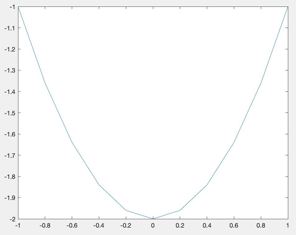
As you can see, the lines are a bit jagged. Adjust the step size in $x$ so that the line becomes smoother
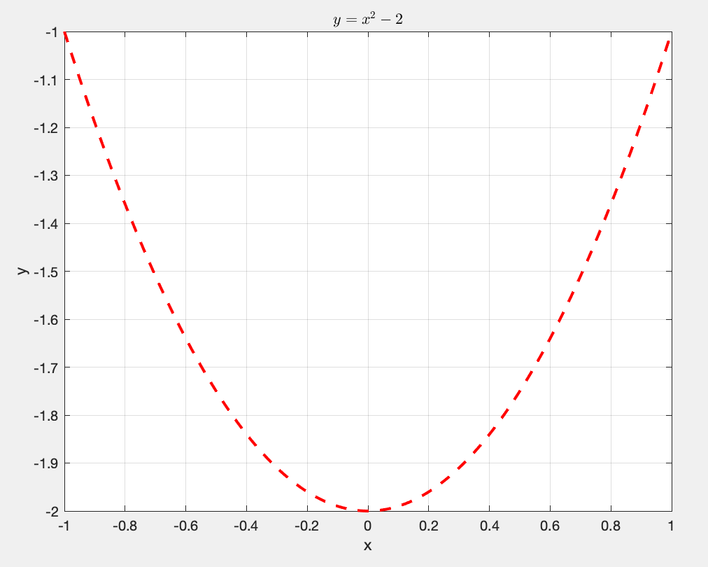
Graph settings
MATLAB offers plenty of customisation which can help improve how our graphs look. For example, within the plot function, we can change the appearance of the line:
plot(x,y,'r--',LineWidth=2) % creates dashed red line with thicker line width.
We can also add a grid and label the axes and title, but ensure that the text is in apostrophes('):
grid on                                    % adds a grid to background
xlabel('x')                                % labels bottom axes
ylabel('y')                                % labels side axes
title('$y = x^2 -2$',Interpreter='latex')  % adds title using a LaTeX interpreter
Top Tip: If using a latex interpreter, use the dollar sign ($) either side of the maths.
Check out the MATLAB (https://www.mathworks.com/help/matlab/ref/plot.html) page for more information.
The MATLAB website provides a comprehensive guide to its in-built functions which is extremely helpful when starting out coding.
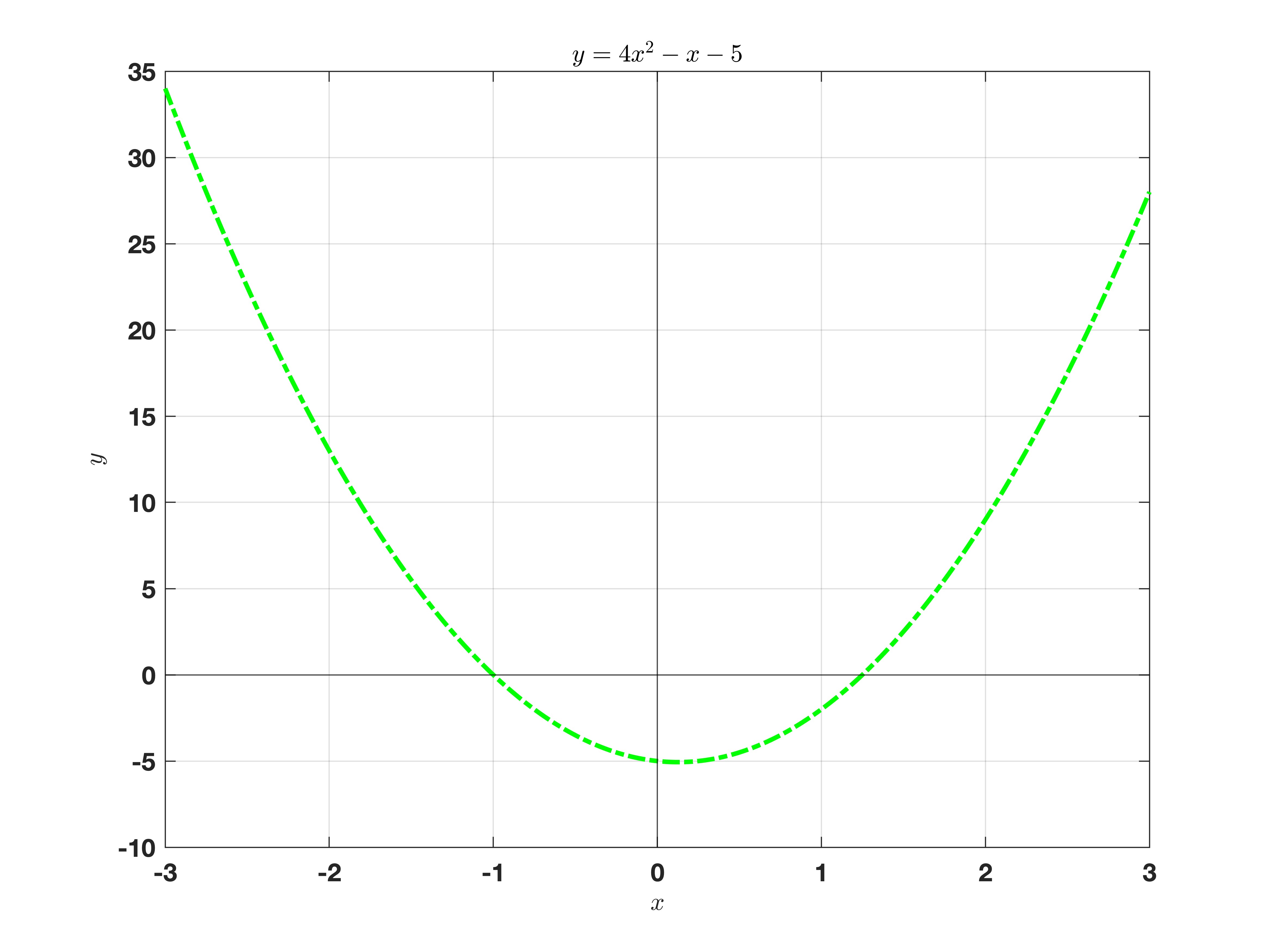
Task 3a
Create a script that replicates the following graph for $y = 4x^2 -x - 5$:
Multiple plots
Sometimes we may want to plot on the same figure. This is commonly completed in two ways: using hold or subplot.
hold
Let’s consider the sine and cosine functions we wish to plot on the same figure: $y = \sin(x)$ and $y= \cos(x)$. We could easily create a matrix with the output data with the following code:
% Create data
x = -pi:0.01:pi;
y = [sin(x); cos(x)];

% plot data
p = plot(x,y);
grid on
xlabel('x'), ylabel('y')
legend('sin(x)','cos(x)',Location='NorthWest')

p(1).LineWidth = 2;      % Changes LineWidth of first dataset
This works well when the output data is the same length. Sometimes we wish to overlay onto an existing figure, which can be done using hold. Here is another example:
figure(2)
x = -pi:0.01:pi;
y1 = sin(x); y2 = cos(x);

% first plot
plot(x,y1,'r-')
grid on
xlabel('x'), ylabel('y')
hold on                  % holds plot so nothing is overwritten

% second plot
plot(x,y2,'b-*')
hold off                 % takes hold off.

legend('sin(x)','cos(x)',Location='NorthWest')
Task 3b
Try this yourself using $y = 2\sin(x)$ and $y = x^3 + 4x -3$
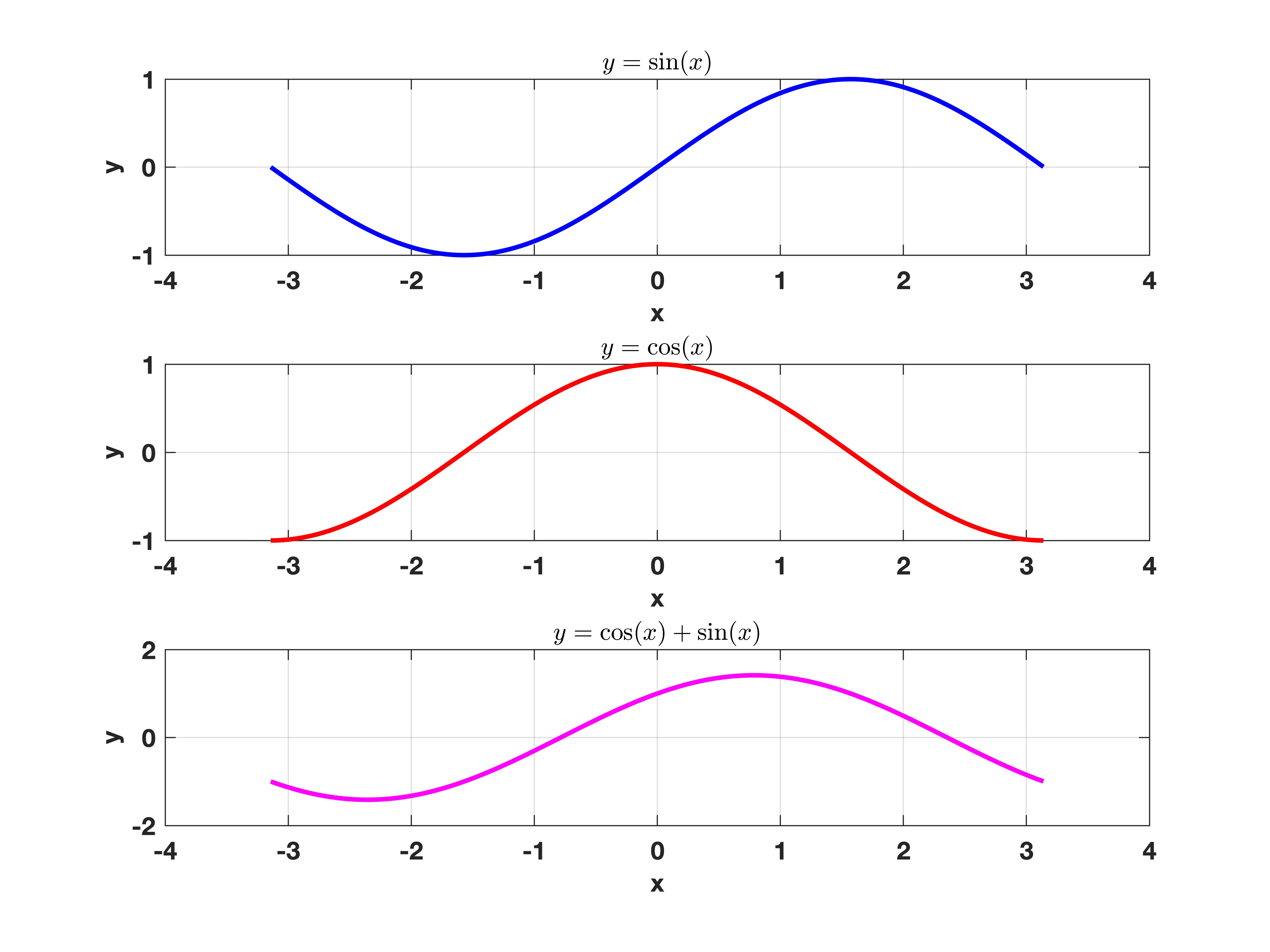
Subplots
Subplots enable you to have multiple plots on the same figure. This can make presenting information/data related to each other much easier to read, ideal in publications. To get two plots side-by-side, use the following command:
x = -pi:0.01:pi;
y1 = sin(x); y2 = cos(x);

figure(3)
subplot(1,2,1)            % Creates subplot ( 1 row, 2 columns), and plots at 1st position
plot(x,y1)
grid on
xlabel('x'), ylabel('y')
title('$y = \sin(x)$',Interpreter = 'Latex')

subplot(1,2,2)           % Creates subplot ( 1 row, 2 columns), and plots at 2nd position
plot(x,y2)
grid on
xlabel('x'), ylabel('y')
title('$y=\cos(x)$',Interpreter = 'Latex')
Task 3b
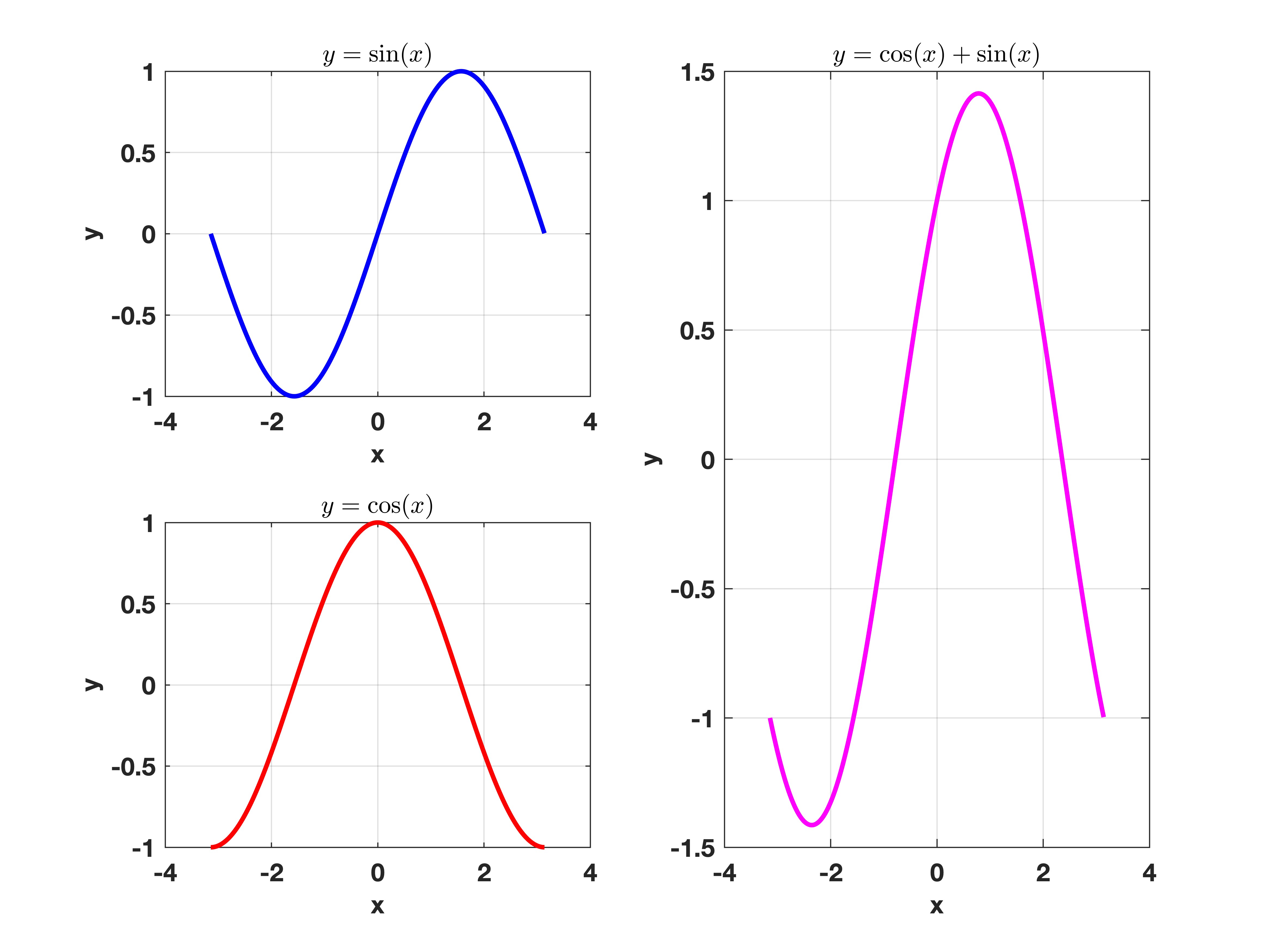
By modifying the above code, assign a new variable y3 = y1 + y2. and create a subplot of the 3 plots (y1, y2, y3) arranged vertically**
We can even do 2-dimensional grids for plots. What’s more, we can overlay plots over neighbouring grids by selecting the correct indices:
subplot(2,2,[2,4])
plot(x,y3)
Task 3d
Adapt the above code to produce the following graph:
Bar charts
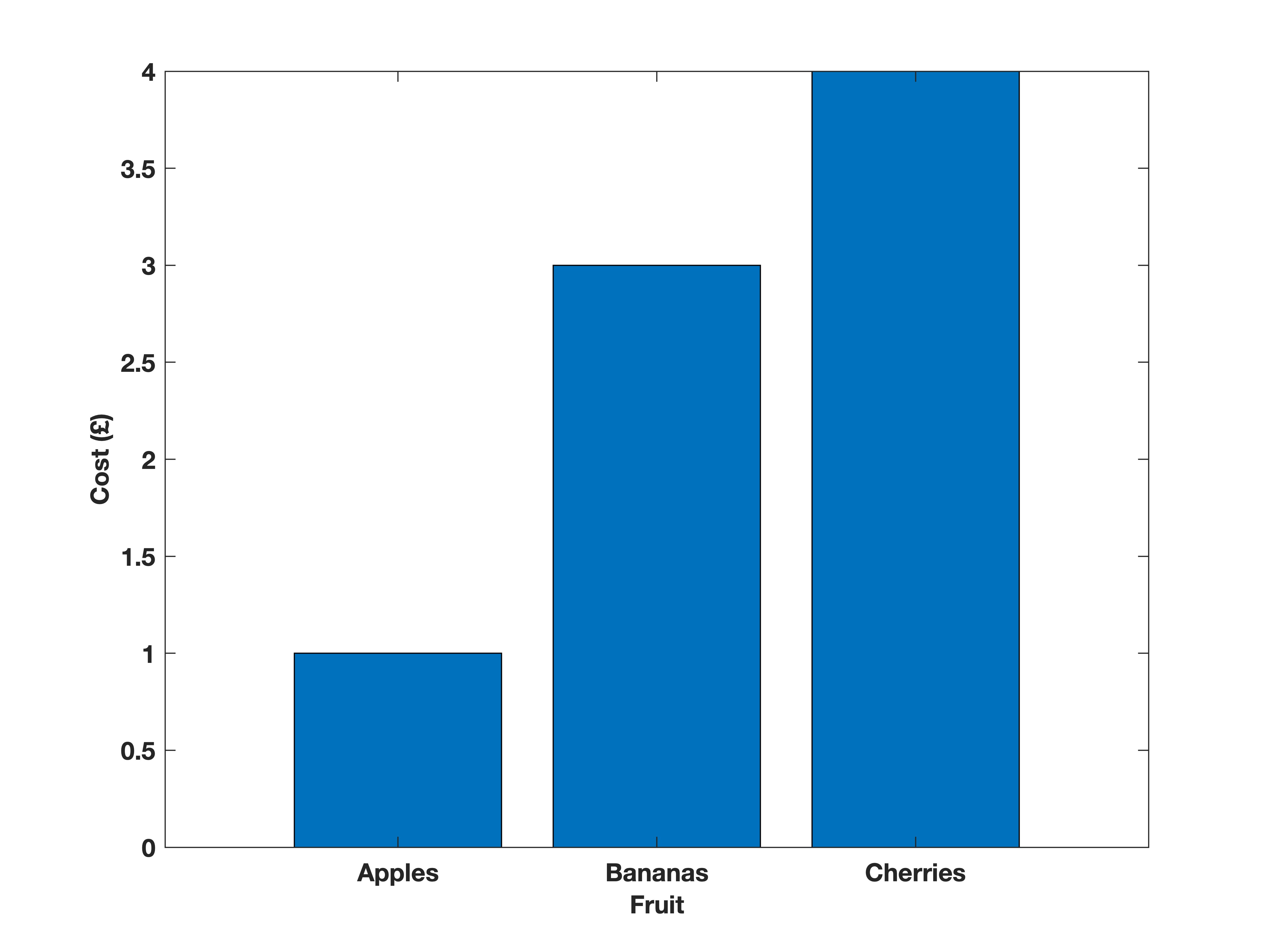
Another popular plot is the bar graph. The difference for this function is that the x-axis needs to be categorial, which can include strings or a sequence of text. To stop confusion between variable names, we enclose the text in with speech marks " or apostrophes '. Below is an example of a bar graph code for the cost of some objects:
fruit = ["Apples", "Bananas", "Cherries"];
cost = [1, 3, 4];

bar(fruit,cost)
xlabel('Fruit')
ylabel('Cost (£)')
Task 3e
Create a bar graph of eye colour in the group.